Prototipo Hight Fidelity
Foodsy is my first UX-UI project in my User Experience course at NEOLAND.
Initial Idea
The initial idea comes from my experience of arriving home and not knowing what to prepare to eat, which reminded me that when I lived with my parents, my mom always asked what we would like.
I conducted a survey among my acquaintances to investigate if it was something common in every household and the answers were similar : “It’s a headache to decide what to eat and cook every day.”
Challenge/Hypothesis
Therefore, I started from the hypothesis that parents arrive tired from their various activities, not wanting to cook, not liking to cook and not wanting to waste the little time they have doing it.
How to make parents’ lives easier when it comes to feeding their children healthily.
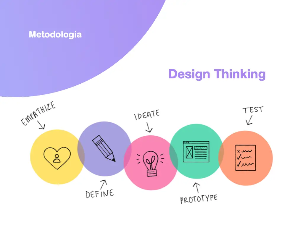
To validate the hypothesis and be able to carry out the project. I used the design thinking methodology. Through the following steps:
1- Research
2- Analysis
3- Design
4- Testing-Prototype
Research
1.1 Benchmarking
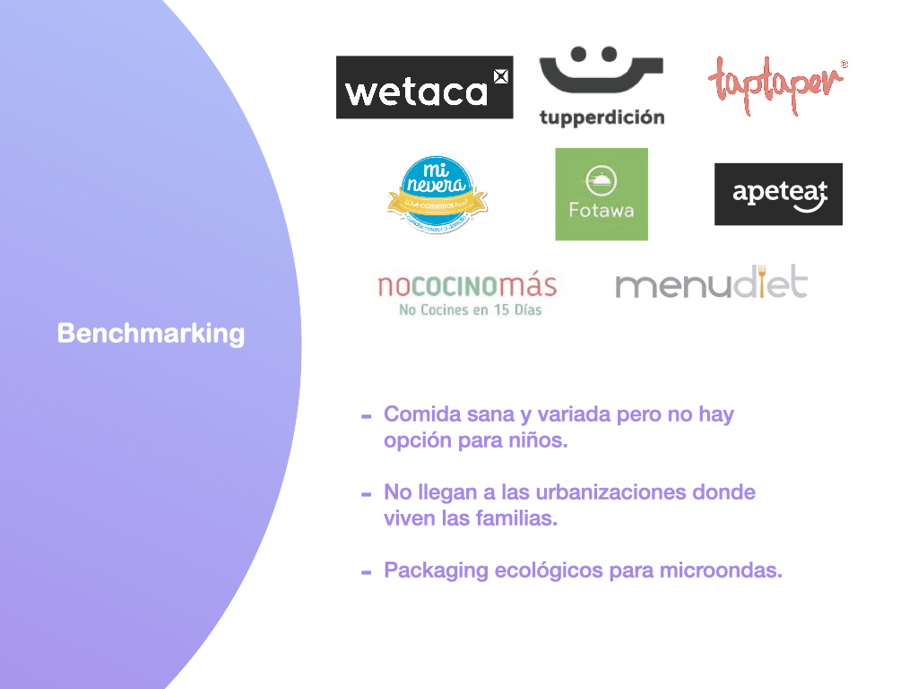
When doing the research through Benchmarking I saw that there were websites or apps to develop a weekly menu, or healthy food at home and I realized that this market was covered, but it lacked focus on the child consumer.
1.2 User
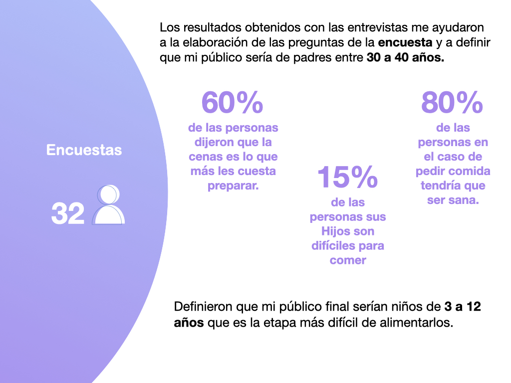
I conducted interviews and surveys with parents of different ages, work shifts, income and with children of different ages. To find out who could be my user.
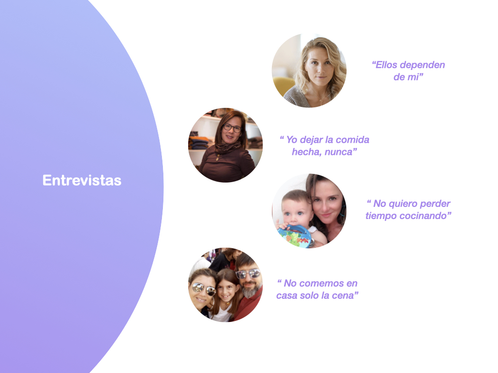
The conclusions obtained from these interviews were the following:
The biggest general problem is a lack of time in terms of food and dinners.
They do not want to invest time in cooking but in other activities.
Food purchases are made close to home.
The biggest expense of the month is food.
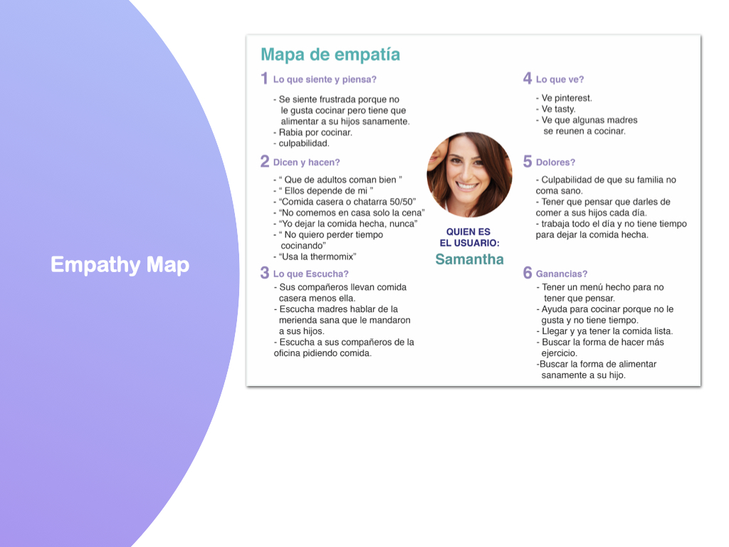
To make an analysis and synthesis of all the information obtained, I made a User Persona and an Empathy Map.
User Persona
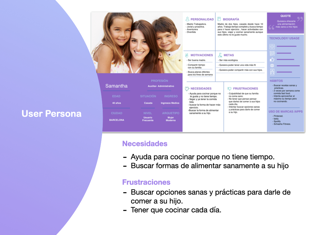
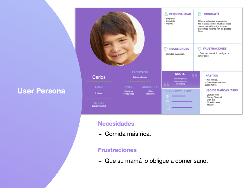
It is the creation of a user or several users through an archetype of the union of several interviewed profiles which we call User Persona.
In my case my user is Samantha, a 40 year old working mother with two children. Her biggest frustration is feeling guilty that her family does not eat healthy and having to think every day about what to feed them. And her son Carlos who would be our final consumer.
Journey Map
We make a Journey MAP a situation from the moment our user wakes up and thinks about dinner until the end of his day and it is his turn to serve it. With the objective of seeing the points where there may be needs and opportunities can be generated.
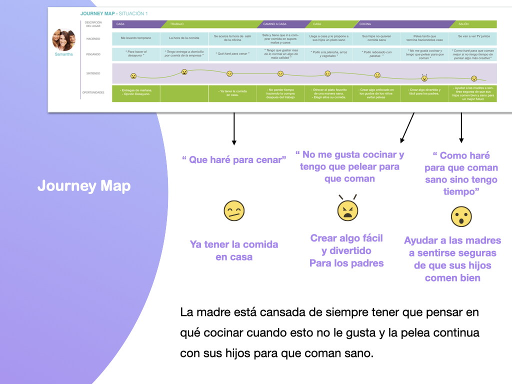
In conclusion, the mother is tired of always having to think about what to cook when she does not like it and the continuous fight with her children to make them eat healthy.
3. Design
3.1 How, Now and Wow?
Next, with the How-Might-We, brainstorm possible opportunities and ideas to solve our mother’s frustrations. From these brainstorm the top 3 opportunities and 7 ideas or solutions plus Now and Wow.
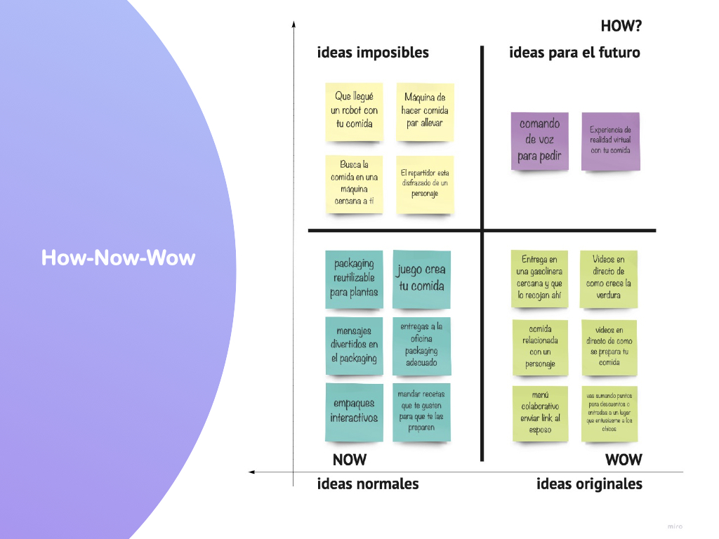
Finally, I came to the conclusion that the idea of a healthy food service for children related to a character, with fun and safe packaging and delivery adapted to the parents’ day-to-day life is the best idea to solve the most critical user problems. These are the best ideas to solve the most critical problems of the users.
3.2 Value Proposition
With the value proposition we prove that the user’s problems can be solved with our service.
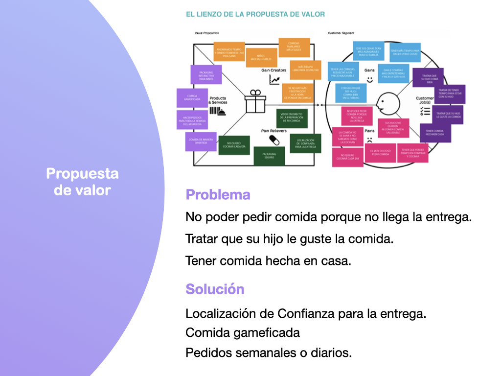
For example:
Problem
Not being able to order food because the delivery doesn’t arrive.
Trying to get your child to like food.
Having homemade food.
Solution
Reliable delivery location.
Gameified food.
Weekly or daily orders.
3.3 Ideation process
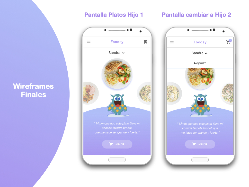
In order to define the utilities of the application and make it gamified, I started making low-fidelity sketches or wireframes, as a kind of wire-flow, and see its flow.
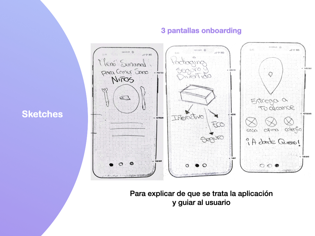
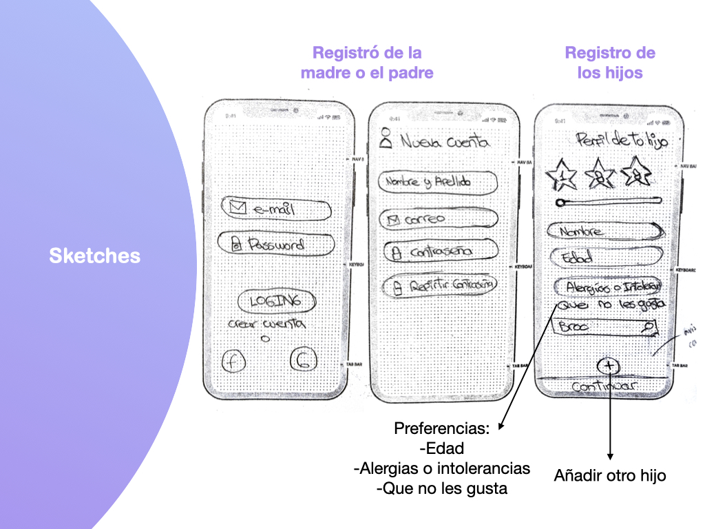
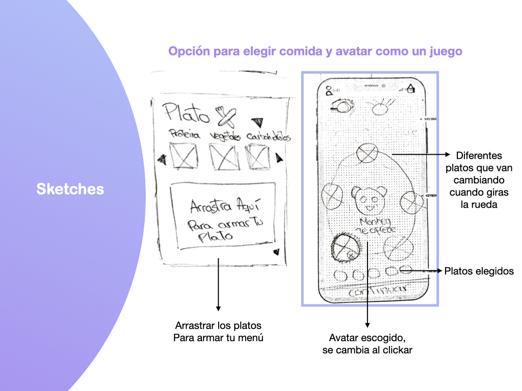
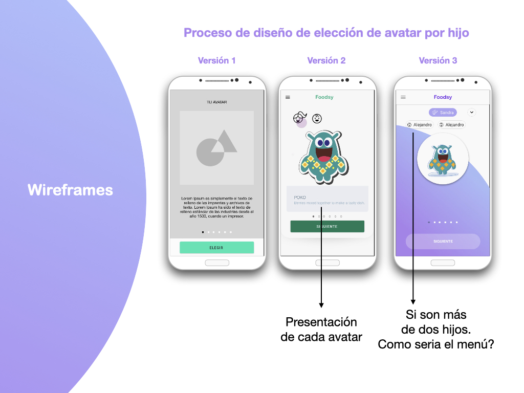
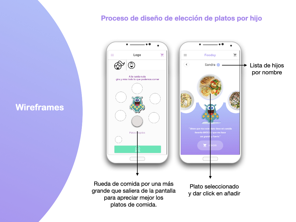
Doing this process I discovered that my biggest difficulty was my main screens like choosing an avatar and a menu for each child in a playful way for my end user. So I had to make several wireframes of the same screen until I defined what was the best flow to understand the functioning of my app.
3.4 UI
Look & Feel
I created a mood board of what’s on the market, comparing the colors and styles of other food and children’s game apps.
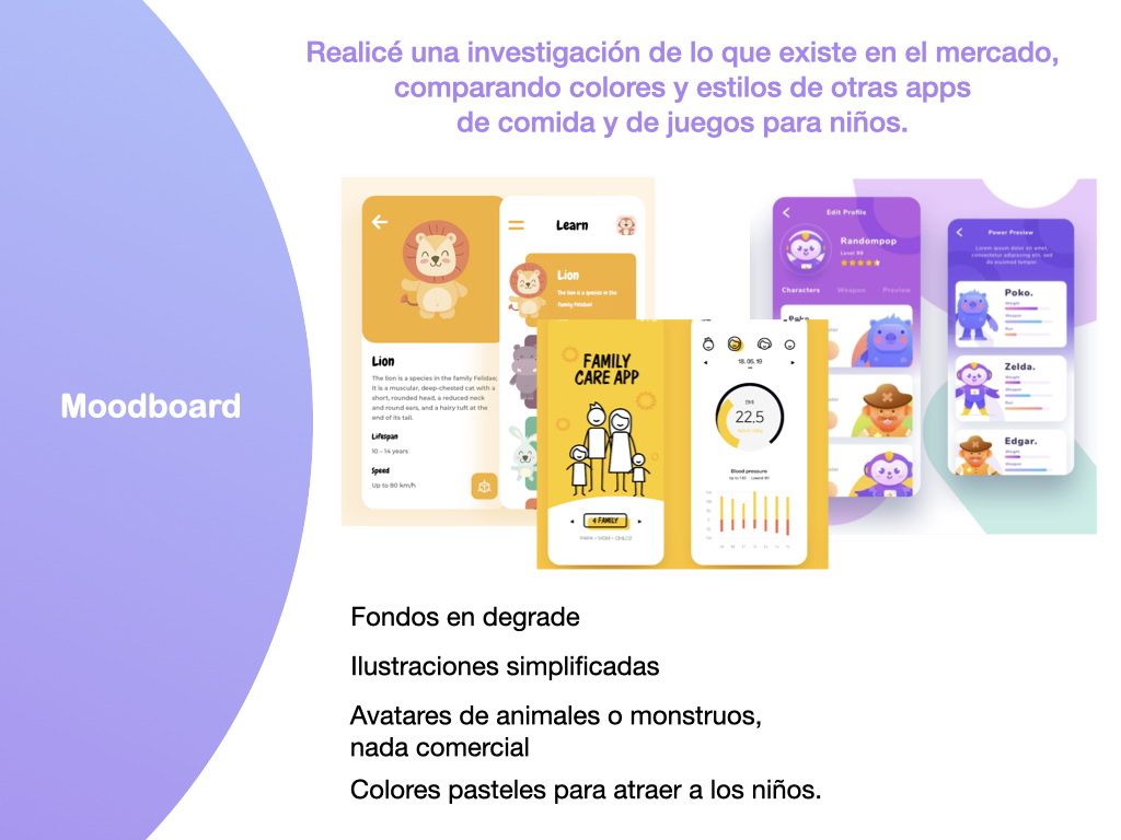
Where I drew the conclusion that the app had to have:
– Gradient backgrounds.
– Simplified illustrations.
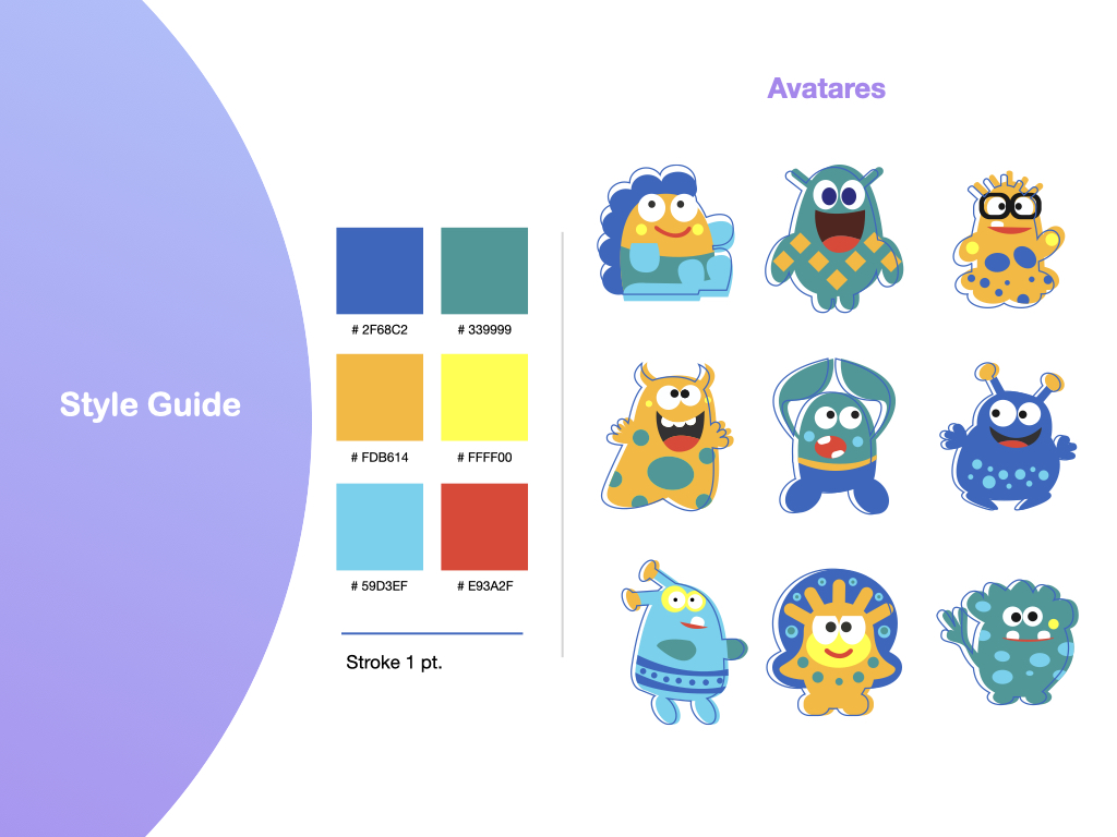
– Avatars of animals or monsters nothing commercial.
– Pastel colors to attract children.
3.5 Branding / Style Guide
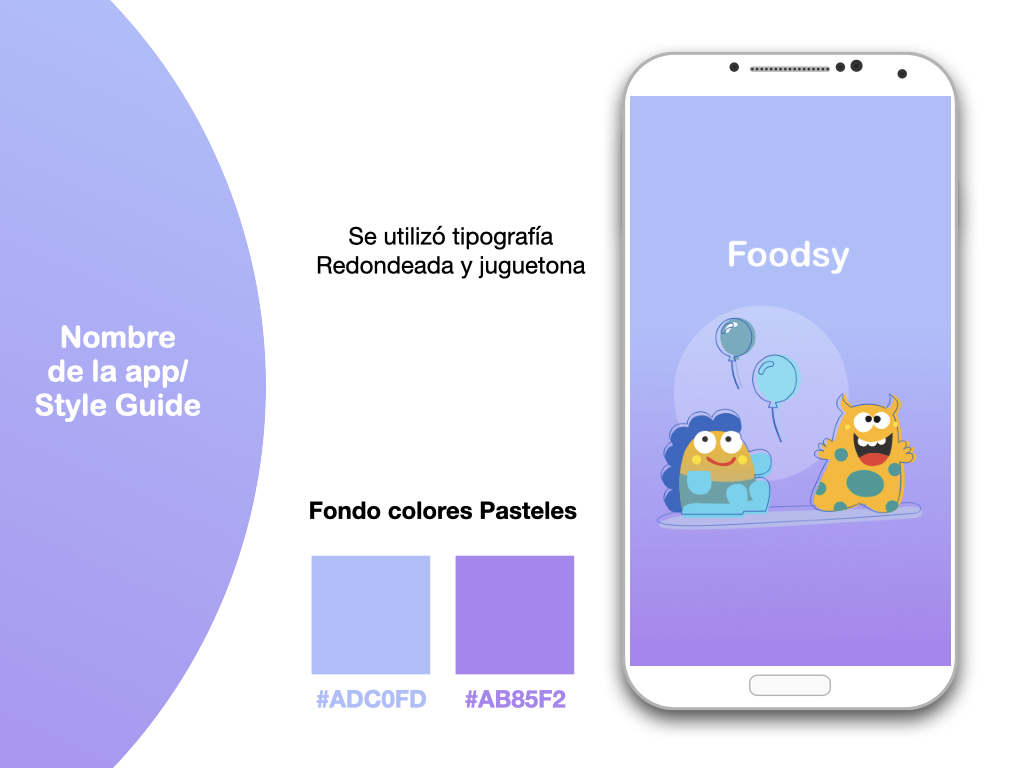
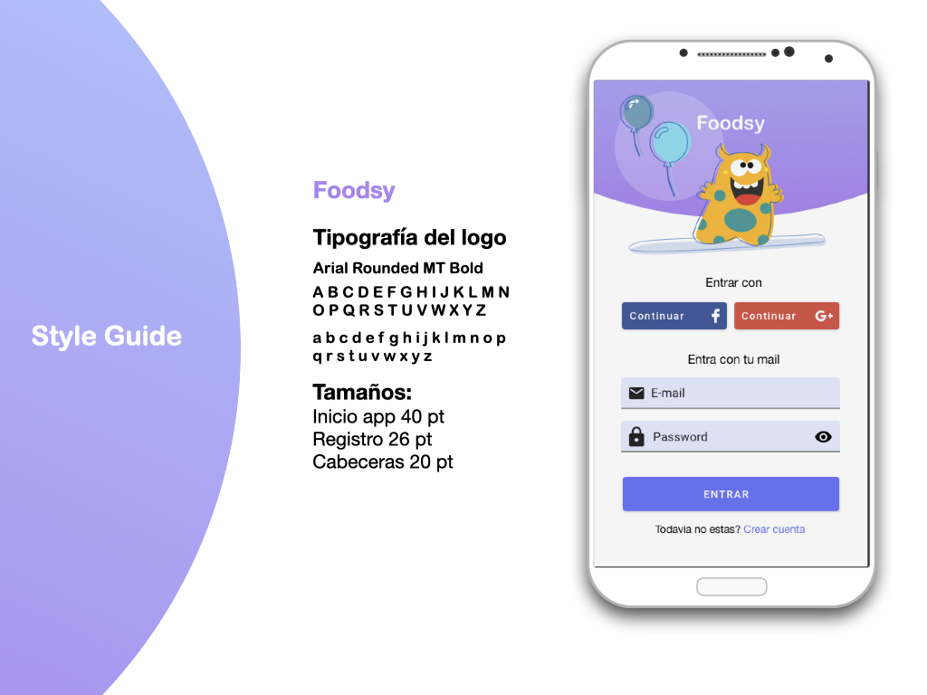
The name comes out of the mix of the phrase Food`s Ready making it shorter, entertaining and easy to remember.
4.1 Prototype
Foodsy has two users: the parent who uses the app with or without their children and the end user’s children.
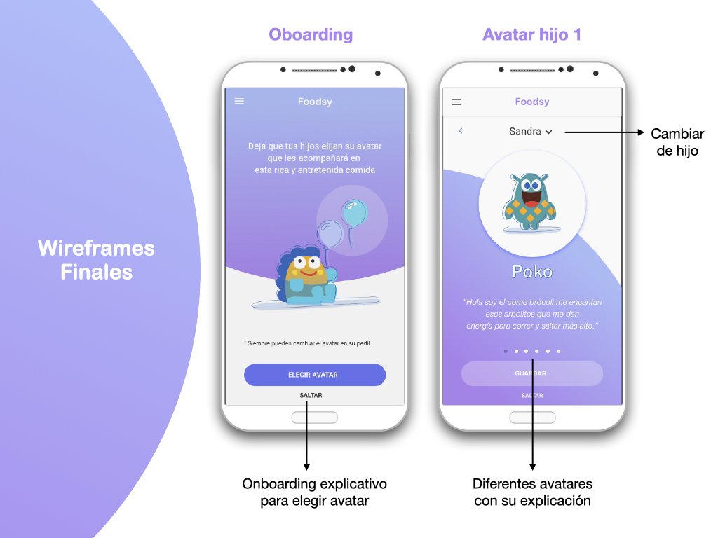
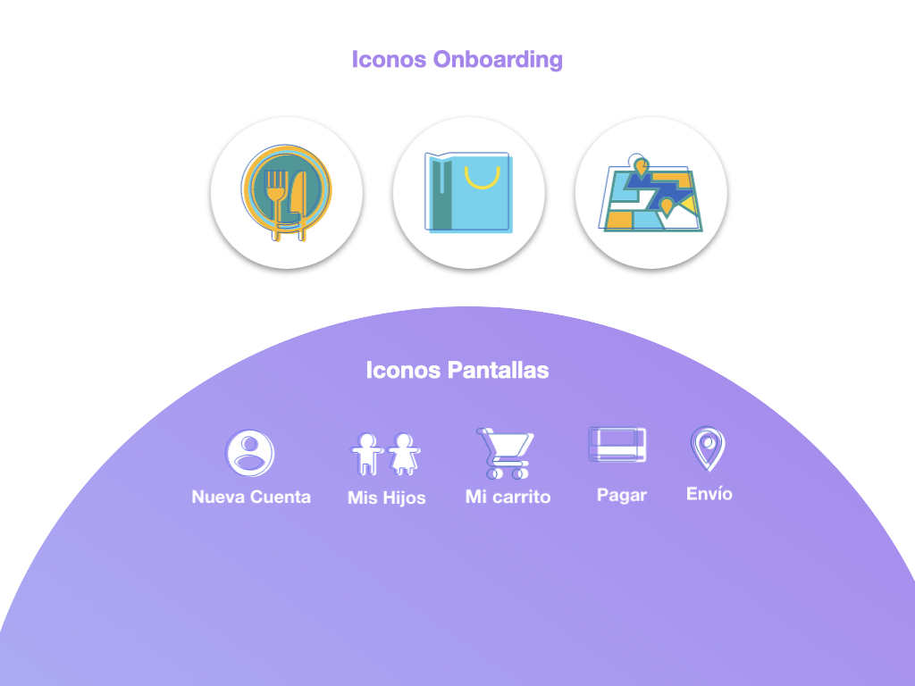
For this prototype, I designed the corresponding screens: three onboarding that explain how the app works, the first time registration, the registration of the children with the indications of their needs to create customized menus, the choice of the avatar that will accompany them until the end of their order and who will be inside the packaging with their food (happy box type), the menu selection, their final order (shopping cart) and the delivery to the destination of the user’s choice.
4.2 Testing
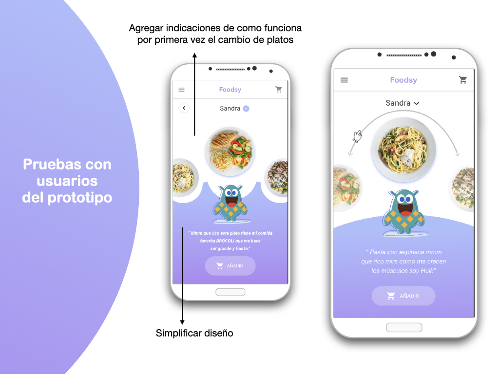
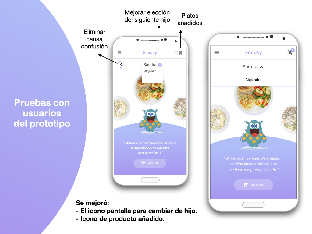
After making the prototype in Adobe XD I made a small test on some users, their comments allowed me the opportunity to change some actions that were still not well understood for example:
Next Step
– Add options to remove ingredients.
– Add more avatars.
– More interaction.
– Share the menu with another user.
– Simplify other details.
– Create App Web Page
